Hi, I’m Olivia Dennehy — a UX/Product designer passionate about accessibility, user empathy, and thoughtful digital experiences.
From freelance clients to award-winning hackathon projects, I’ve designed intuitive, responsive interfaces across web and mobile technologies. I thrive on making technology more inclusive, blending solid user research with a strong eye for accessible design. Whether I’m presenting to teams or prototyping user flows, I bring energy, clarity, and a deep commitment to creating experiences that truly serve the people who use them.

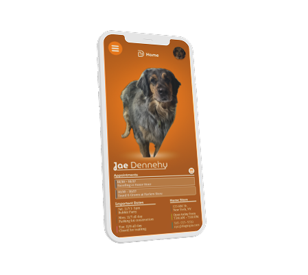
Yikes! This is one of my first Javascript websites in a freshman year class project. It features moveable text, textboxes, hoverable color-changing text, and my enthusiasm for orange.
I was brand new to web design in this era. I was still focused on becoming a developer. My passion for the UX/UI field started to grow from here.

Enel is company that creates innovation solutions for the energy sector. There, I was tasked with maintaining the most comprehensive Figma Design Library I've ever seen. I also assisted in designing the Beta version of a new comprehensive sales tool "Optima".

Worked with a local politician to establish a high-impact visual identity from the ground up. The aim was to create a design that is simple and professional yet bold enough to stand out against conventional competitors. We explored various concepts, including this emblem inspired by the iconic arched US House & Senate seating arangement flipping.
Check out my recent favorite projects below:
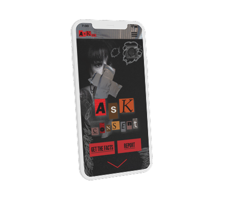
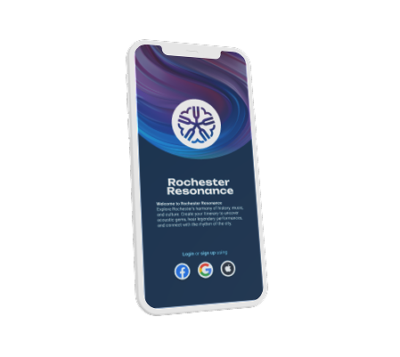
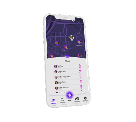
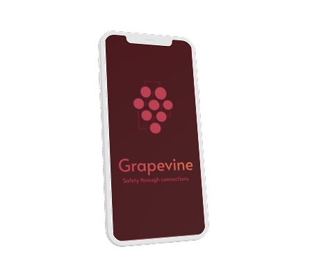
An app that utilizes the unique acoustic environments of the cityscape to create an itinerary of things to do built around the music scene of the city.

Internship research capstone and presentation design showcase.

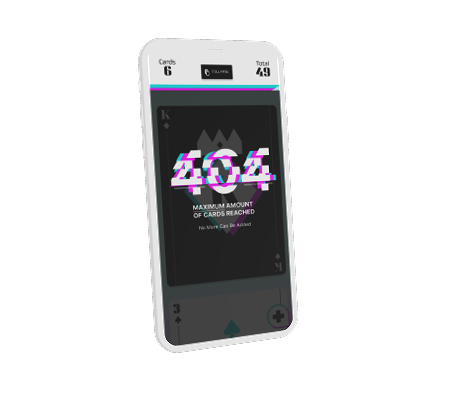
A playable modern spin on tamagotchi starring RIT's beloved mascot Balloon Ritchie made with Figma and 3D animation platform Spline.
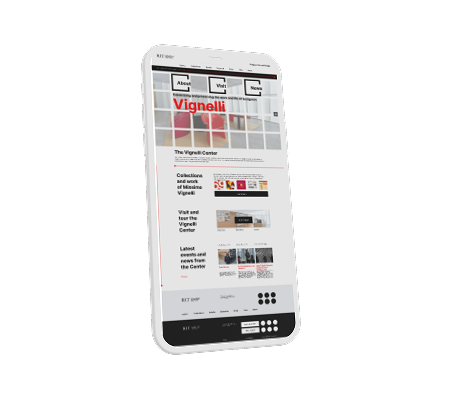
A reimagined website celebrating the famous designer Massimo Vignelli as hosted on the RIT's archive with their branding seamlessly integrated.
Don't just hear it from me, hear it from my clients and former employers: